|
Demonstrations |
||
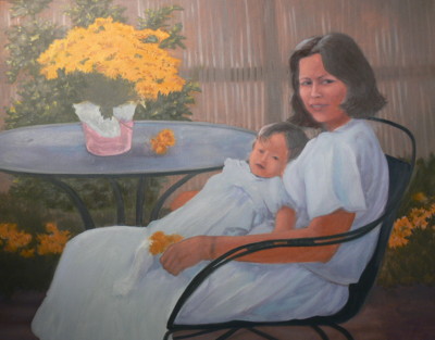
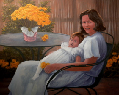
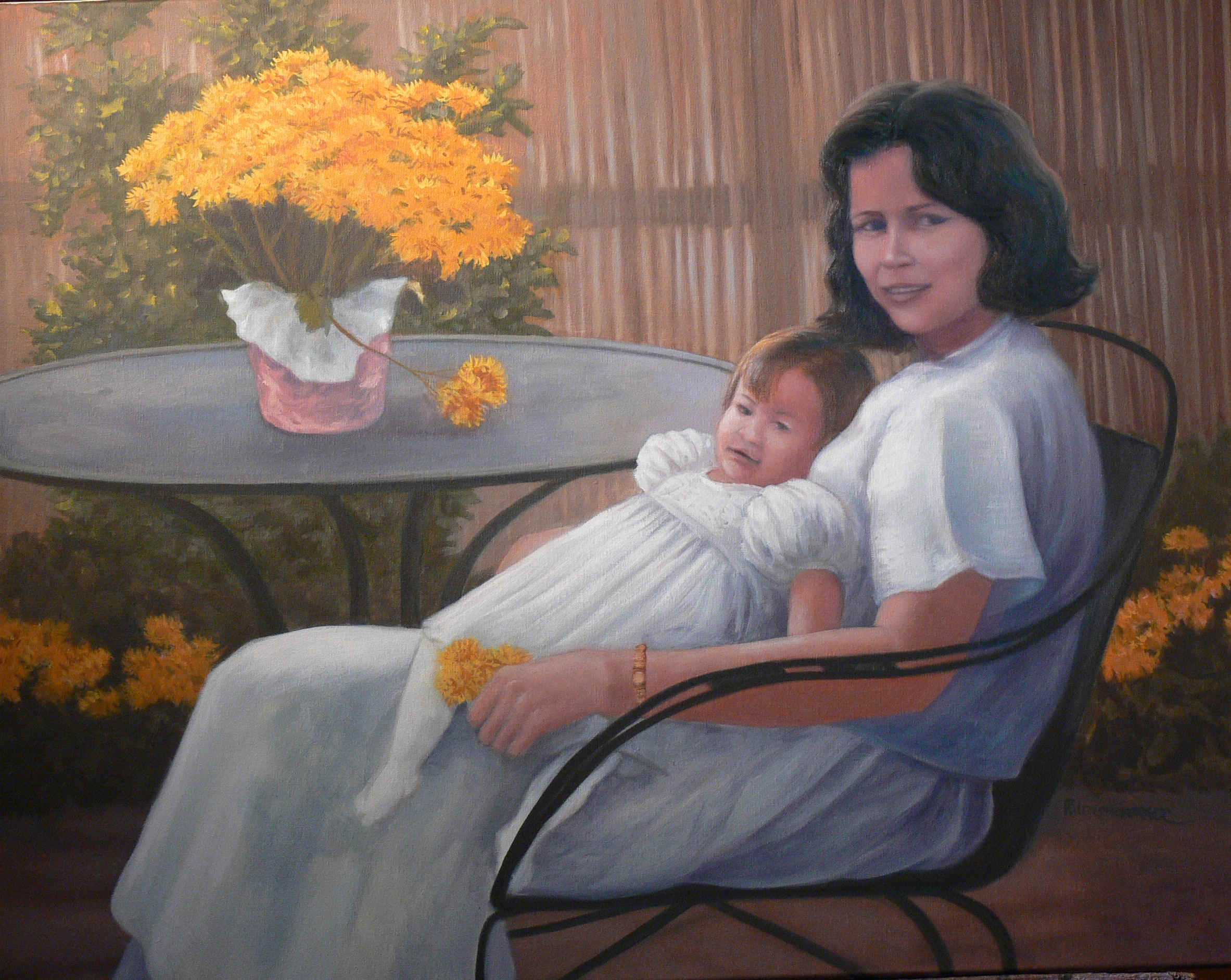
Mother and Child -- 2006:
this was a commission piece, painted from a client supplied photograph. It was a combination that I normally turn down, but as always, there are the exceptions to every rule. It can be because the request comes from a friend or special student, because it has a compelling story, or simply because your curiosity, vanity, or wallet has become intrigued. This painting was to be a birthday gift to the subjects' mother and grandmother, who was turning 92 years old.
The process is not my current process, but rather a throwback to an earlier time. It was needed in two weeks (across a time period already filled with obligations), so I reverted to a safer procedure, mainly because there was little time for observation and reflection -- no time to face it to the wall before looking at it again.
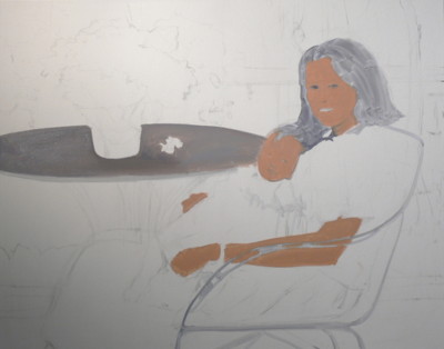
I drew a charcoal drawing by imposing a grid on a photocopy (of the source) and then making a similar, although larger, grid on the canvas. This method makes it fairly easy to create a detailed drawing.
I start to fill in the shapes with flat, mid-range (medium toned) colors. I have decided to use a limited palette, that will help unify the painting -- part of this decision was due to the limited time that I could devote to the work.
At this point, I am using: Yellow ochre, cadmium red light, cerulean blue, and Titanium white. If you are new to painting or if you are feeling a little lost in your current process, then I suggest that you sit down and play with this combination. It gives you wonderful flesh tones, lush natural greens, soft cool blues, rich grays, and so many other colors. Don't forget to mix some compliments in to soften colors. Later for some of the more brilliant yellows, I will use cadmium yellow. for some of the richer, darker colors, I will add Thalo Blue and Burnt Sienna.
Throughout this painting I am using turpentine as the thinning agent and relying on the oil in the tube colors to be the basic medium. This is a technique more often used in plein aire painting to help speed the drying time, but used here because of the short notice.
Still continuing the block-in with flat colors. the main goal is to fill the canvas, so that I can see the colors against each other, rather than the exaggerated contrast that happens between the white of the canvas and the colors.
It's completely blocked-in! Notice how light the skin tones look when compared to the starting photo. As the darker background surrounds the lighter skin shapes, the contrast becomes apparent. The garments are the only areas where the light/shadow pattern has been developed. I didn't want to loose this pattern.
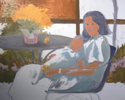
here, I started adding darker areas. Mainly delineating the edges where darks are going to meet other values. I have added thalo blue and Burnt sienna to my palette.
The most obvious change is the color of the flowers in the background. The fencing in the background has started to reveal texture and backlighting. I've started to model the flesh-tones, working with the lighted areas.
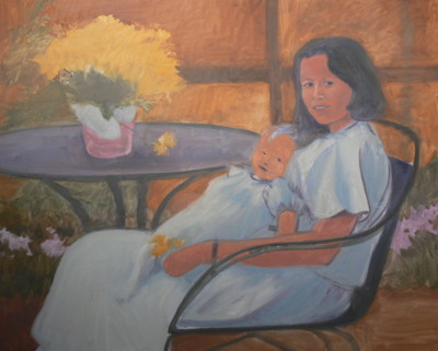
Casting more light on the flesh-tones.
Working with the shadows.
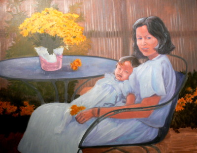
More modeling, using rim light to help create an illusion of depth with the foreground and the background.
I've opened up the eyes and in the process, changed much of the face. The coloring of the skin has been softened.